The time has come to reimagine your shopping cart. For years, it's served as the connection between the shopping experience and the checkout process, but now it needs to do more. Consumers aren't shopping like they did in the early days of e-commerce, and it’s time for the shopping cart to catch up.
The shopping cart no longer signals the beginning of the often daunting checkout process. Instead, consumers are using the cart to store items with plans to shop at a later time. According to Consumers Tell All, a recent study conducted by Bronto, 73 percent of shoppers use the cart to store items they plan to buy later.
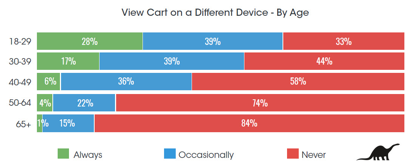
The study looked at two ways online shoppers plan to revisit items left in their shopping carts: on a different device and while in-store. Overall, 40 percent of online shoppers plan to view carts again, but the data also shows that younger shoppers are leading this trend.
More than half of all online shoppers under 40 leave items in the shopping cart with plans to view later on a different device. More than two-thirds of millennials, or digital natives if you prefer, view carted items later on a different device, and 28 percent of these 18- to 29-year-olds do this every time they shop!
A similar trend was apparent for shoppers using carts to move between sites and store locations. As with device transitions, this behavior declines with age, though I expect that these device and channel connections will become more common for all ages as mobile devices become more deeply integrated into the shopping experience.
You can help bring these consumers back to your site with shopping cart reminder emails, and you can optimize your cart in many ways to discourage folks from leaving items behind in the first place. However, because we know consumers will revisit their carts, it’s to your advantage to focus your efforts on making it easier to shop and buy when they return.
While you've probably invested time and resources into optimizing your site for mobile devices, you may have overlooked your shopping cart or at least some elements of cart functionality that could help maintain the shopper’s momentum as they revisit the cart on a different device. Your cart may look fantastic on mobile devices, but does it retain features that could help the shopper decide to buy? Here are a few elements I often see stripped from mobile carts that could help shoppers:
- quantity, size and color adjustments;
- product images, ratings and descriptions;
- promo code entry fields;
- customer service links and phone numbers;
- order total with estimated shipping costs and/or shipping options; and
- store locator links.
These elements can also benefit shoppers who revisit a cart in-store, though there are additional features you can include on the cart page to help these folks navigate the in-store experience. Many store shoppers may not want to interact with store staff, or they may not be able to find someone to help. Think of the most commonly asked questions your store customers have and find ways to incorporate that information on the cart page. Here are a few things to consider:
- inventory lookup;
- loyalty program details;
- weekly store sale information;
- home delivery policies;
- financing options; and
- product FAQs.
While it’s impossible to anticipate every need for the shopper who plans to revisit their shopping cart, you can try to address the majority of questions they would have before making a purchase decision. Including all of these content elements would surely clutter the cart page, especially on a mobile device, so take the time to test and prioritize content that works best for your customer. Include what doesn’t make it to the cart in the cart reminder email to give these shoppers a quick and easy way to find the information they need.
Jim Davidson is the head of research at Bronto, a cloud-based marketing automation software provider.
Related story: 5 Dos and Don’ts for Weather-Related Emails
- Companies:
- Bronto Software


